Color Theory
What is Color Theory?
Color theory is a framework that explores how colors interact, the emotions they evoke, and how they influence human perception. Rooted in both science and art, color theory helps us understand the relationships between colors and how they can be combined to create harmony, contrast, or impact.
You can take all of this with a grain of salt because people are simply, unique. There are many factors, experiences and preferences in our lives that can influence how people react to certain colors but there seems to be general consensus around each color family that can help aid in our use. The best way to assess what colors mean to the people around you is to talk, and if you’re investigating your perception make sure you are connected to all of your senses and anywhere in your body that you notice your intuition, take notes and stay curious.
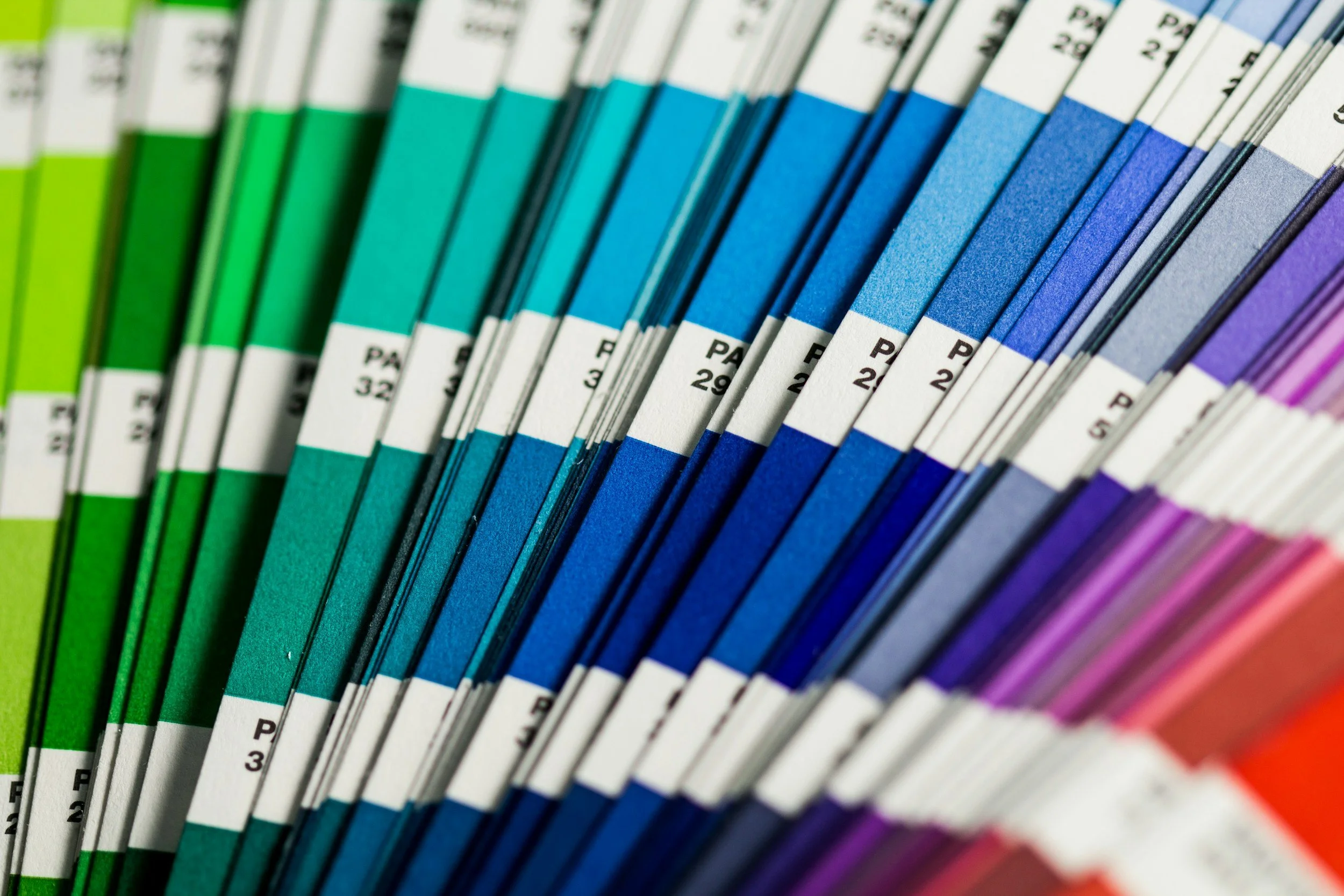
At its core, color theory is based on the color wheel, which organizes colors into three main categories:
Primary Colors: Red, yellow, and blue—these cannot be created by mixing other colors.
Secondary Colors: Green, orange, and purple—formed by mixing primary colors.
Tertiary Colors: Created by combining primary and secondary colors.
Key Principles of Color Theory
Color Harmony: Certain combinations of colors (e.g., complementary, analogous, or triadic) are visually appealing and create balance in design.
Color Temperature: Colors are categorized as warm (reds, oranges, yellows) or cool (blues, greens, purples), influencing mood and energy.
Color Context: The meaning of a color can change depending on its surrounding hues or cultural context.
Why is Color Theory Important?
In Art: Artists use color theory to evoke emotions, direct focus, and create meaning in their work.
In Marketing: Colors influence how consumers perceive brands and make purchasing decisions.
In Interior Design: Colors shape how we experience spaces, affecting mood, comfort, and energy.
By understanding color theory, you can strategically use colors to communicate ideas, tell stories, or transform experiences.

Pink
Color Psychology: Represents compassion, nurturing, femininity, and romance. Can evoke calmness and reduce aggression.
Marketing: Often used for products aimed at women, beauty, or children. Creates a sense of care and softness.
Interior Design: Adds warmth and a calming effect. Light pinks can make spaces feel soothing, while hot pinks energize.
Impact in Art: Evokes feelings of love, vulnerability, and nostalgia. Light pinks are calming, while brighter pinks feel energetic or playful.
Emotional Response: Often connects with themes of femininity, innocence, or joy. Can be used to soften intense compositions or convey tenderness.
Art Style: Works well in romantic, whimsical, or abstract styles.

Red
Color Psychology: Associated with passion, energy, urgency, and love. Stimulates appetite and increases heart rate.
Marketing: Grabs attention; often used in sales, promotions, and food branding. Evokes urgency and excitement.
Interior Design: Creates warmth and intensity. Best as an accent color in dining areas or social spaces.
Impact in Art: Creates drama, urgency, and passion. Draws immediate attention and can dominate a composition.
Emotional Response: Stimulates energy and intensity, but prolonged exposure can feel overwhelming. Often linked to themes of love or conflict.
Art Style: Ideal for bold, expressive, or provocative pieces.

Orange
Color Psychology: Represents energy, enthusiasm, warmth, and creativity. Encourages interaction and activity.
Marketing: Used to draw attention without being as aggressive as red. Associated with affordability and adventure.
Interior Design: Adds cheerfulness and energy. Works well in kitchens, workout spaces, or playful areas.
Impact in Art: Radiates warmth and vitality. Encourages a sense of movement and energy while remaining approachable.
Emotional Response: Inspires creativity and enthusiasm. Can create a feeling of spontaneity or adventure.
Art Style: Suits dynamic, vibrant pieces or nature-inspired works, like sunsets or autumn landscapes.

Yellow
Color Psychology: Symbolizes happiness, optimism, and clarity. Can stimulate mental activity but may cause anxiety in excess.
Marketing: Creates a sense of positivity and warmth. Common in brands aiming for friendliness and accessibility.
Interior Design: Brightens spaces and makes them feel lively. Pale yellows can feel soft, while bright yellows energize.
Impact in Art: Symbolizes optimism and brightness. Attracts the eye but can be jarring if overused.
Emotional Response: Encourages happiness, but in excess, can evoke anxiety or restlessness. Often associated with sunlight and positivity.
Art Style: Works in abstract or impressionist art to create highlights and vibrant focal points.

Green
Color Psychology: Represents growth, health, harmony, and nature. Associated with relaxation and balance.
Marketing: Signals eco-friendliness, health, and wealth. Popular in organic and sustainable brands.
Interior Design: Promotes calmness and renewal. Works well in bedrooms, living rooms, or home offices.
Impact in Art: Represents balance, renewal, and connection to nature. Provides a calming or grounding effect.
Emotional Response: Conveys harmony and peace, making it a soothing presence in compositions.
Art Style: Common in landscapes, naturalistic works, or pieces exploring growth and healing.

Light Blue
Color Psychology: Conveys tranquility, trust, and openness. Reduces stress and lowers blood pressure.
Marketing: Builds trust and reliability. Common in healthcare, technology, and finance.
Interior Design: Soothing and expansive. Ideal for bathrooms and bedrooms.
Impact in Art: Evokes serenity and expansiveness. Creates a sense of calm and openness in the viewer.
Emotional Response: Associated with peace, trust, and spirituality. Helps viewers feel relaxed and introspective.
Art Style: Ideal for tranquil seascapes, skyscapes, or contemplative abstract art.

Dark Blue
Color Psychology: Represents stability, authority, and intelligence. Evokes seriousness and professionalism.
Marketing: Used by corporate brands to communicate trust and dependability.
Interior Design: Adds sophistication and depth. Works well in libraries, offices, or formal spaces.
Impact in Art: Suggests depth, seriousness, and introspection. Can feel somber or sophisticated depending on the context.
Emotional Response: Encourages a reflective or meditative mood. Can also create feelings of authority and stability.
Art Style: Used in moody, formal, or symbolic artwork, often paired with lighter accents.

Teal
Color Psychology: Combines the calming effects of blue with the renewal of green. Represents creativity and emotional balance.
Marketing: Used in brands emphasizing sophistication and modernity.
Interior Design: Feels serene and timeless. Works in kitchens, bathrooms, or transitional spaces.
Impact in Art: Combines calmness with a sense of sophistication. Can feel modern yet natural.
Emotional Response: Encourages emotional balance and creative thought.
Art Style: Effective in contemporary art, especially abstract or minimalist compositions.

Indigo
Color Psychology: Symbolizes wisdom, intuition, and spirituality. Encourages deep thinking.
Marketing: Associated with luxury, mystery, and depth. Appeals to creative or high-end brands.
Interior Design: Creates a rich and moody ambiance. Ideal for meditation rooms or accent walls.
Impact in Art: Suggests mystery, spirituality, and wisdom. Adds depth and richness to compositions.
Emotional Response: Evokes introspection, mysticism, and imagination. Can create a feeling of spiritual or emotional exploration.
Art Style: Frequently used in abstract or symbolic art that aims to evoke profound emotion.

Violet/Purple
Color Psychology: Associated with royalty, luxury, spirituality, and creativity. Stimulates imagination.
Marketing: Used to suggest sophistication and exclusivity. Common in beauty and luxury products.
Interior Design: Adds elegance and drama. Works well in bedrooms, nurseries, or lounges.
Impact in Art: Represents luxury, creativity, and spirituality. Captures attention while feeling balanced.
Emotional Response: Stimulates imagination and introspection. Often associated with fantasy or the mystical.
Art Style: Works in surreal, spiritual, or regal themes, and as a focal point in bold palettes.

Black
Color Psychology: Represents power, sophistication, and mystery. Can feel intimidating or elegant.
Marketing: Communicates luxury, modernity, or authority. Often used in high-end products.
Interior Design: Adds contrast, drama, and sophistication. Works best as an accent or grounding element.
Impact in Art: Conveys power, mystery, or emptiness. Adds contrast and drama.
Emotional Response: Evokes solemnity or intrigue. Can feel intimidating but also elegant when used sparingly.
Art Style: Essential in modern or abstract art, often for negative space or stark contrasts.

White
Color Psychology: Symbolizes purity, simplicity, and cleanliness. Promotes clarity and openness.
Marketing: Often used to represent simplicity, minimalism, and transparency.
Interior Design: Creates a sense of space and brightness. Perfect for small spaces or minimalist designs.
Impact in Art: Symbolizes purity, simplicity, and space. Often used to create a sense of clarity or openness.
Emotional Response: Calms the viewer and focuses attention on other elements. Can feel stark or cold in excess.
Art Style: Dominates minimalist or conceptual art, emphasizing form and subtlety.

Grey
Color Psychology: Represents neutrality, balance, and sophistication. Can feel calming but also dull in excess.
Marketing: Conveys professionalism, elegance, and modernity. Common in tech and corporate branding.
Interior Design: Versatile and grounding. Works well as a base color or neutral backdrop.
Impact in Art: Represents neutrality, sophistication, and ambiguity. Balances and complements bolder colors.
Emotional Response: Creates a feeling of calm or introspection but can feel dull if overused.
Art Style: Common in contemporary or monochromatic works for subtle elegance.

Brown
Color Psychology: Earthy, grounding, and dependable.
Marketing: Suggests reliability and natural products.
Interior Design: Versatile and grounding. Works well as a base color or neutral backdrop.
Impact in Art: Grounds a composition, evoking earthiness and warmth. Adds depth and texture.
Emotional Response: Feels reliable and secure, connecting to themes of nature or heritage.
Art Style: Popular in naturalistic, rustic, or traditional art.

Gold
Color Psychology: Symbolizes wealth, luxury, and success.
Marketing: Evokes prestige and high value.
Interior Design: Adds opulence and glamour. Best as an accent in lighting or decor.
Impact in Art: Adds luxury and brilliance. Draws attention as a highlight or focal point.
Emotional Response: Evokes feelings of wealth, prestige, and divinity.
Art Style: Often used in religious or high-concept art for its reflective and symbolic properties.

Silver
Color Psychology: Represents modernity, innovation, and elegance.
Marketing: Often paired with tech or futuristic branding.
Interior Design: Adds sophistication and coolness. Complements modern styles.
Impact in Art: Suggests modernity and innovation. Adds a sleek, futuristic quality.
Emotional Response: Conveys coolness and sophistication but can feel detached.
Art Style: Common in contemporary or metallic-themed art.